The Header Section in Template Options allows you to customize various aspects of your website’s header.
Here, easily can spot Header Section of your template options. Just navigate Template Options → Header
Header Template
Simply choose from three different header templates, each with a sample preview.
Header Layout
Simply select between light and dark header templates, each with a sample preview.
Top Menu/Navigation
Top Menu is located at the top of your website’s header. It serves as a secondary menu, providing navigation to secondary links on your site. Its components include:
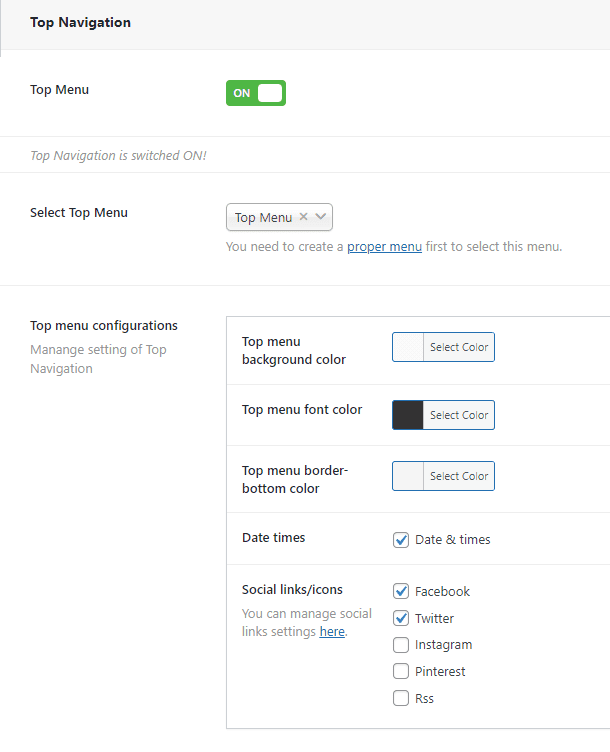
- Top Menu Switcher: Turn the top menu on or off. When enabled, you can configure the top menu.
- Select Top Menu: Choose a menu to display in the top menu.
- Top Menu Configurations:
- Background Color: Set the background color for the top menu.
- Font Color: Customize the font color of the top menu.
- Border-bottom Color: Define the color of the border at the bottom of the top menu.
- Date Times: Display date and time in the top menu.
- Social Links/Icons: Add social icons to the top menu’s right side.
Main Menu/Navigation
Main Navigation typically refers to the primary navigation menu on a website, which contains links to the main sections or pages of the site, and the options as follows:
- Sticky Menu: Enable or disable the sticky menu that stays at the top of the page when scrolling.
- Select Main Menu: Choose a menu to display as the main menu.
You can switch on and create a Mega Menu instead of selecting default menu. Mega Menu enhances the navigation experience on your website. A Mega Menu allows you to display a large amount of content in a structured and visually appealing manner, typically with multiple columns and rich media such as images or icons. This can be particularly useful for websites with extensive navigation needs or complex content hierarchies
Mega Menu
To create a Mega Menu, follow these steps:
- Add items: Click on the button to initiate mega menu items options fields.
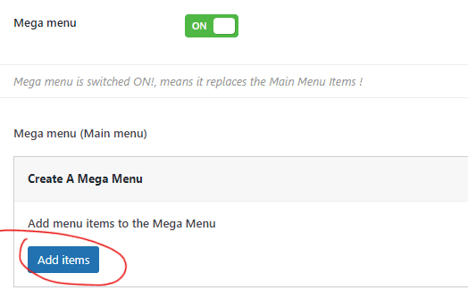
Switch on Mega Menu: Toggle the “Mega Menu” option to enable this feature.
⟶ Add Menu Items:
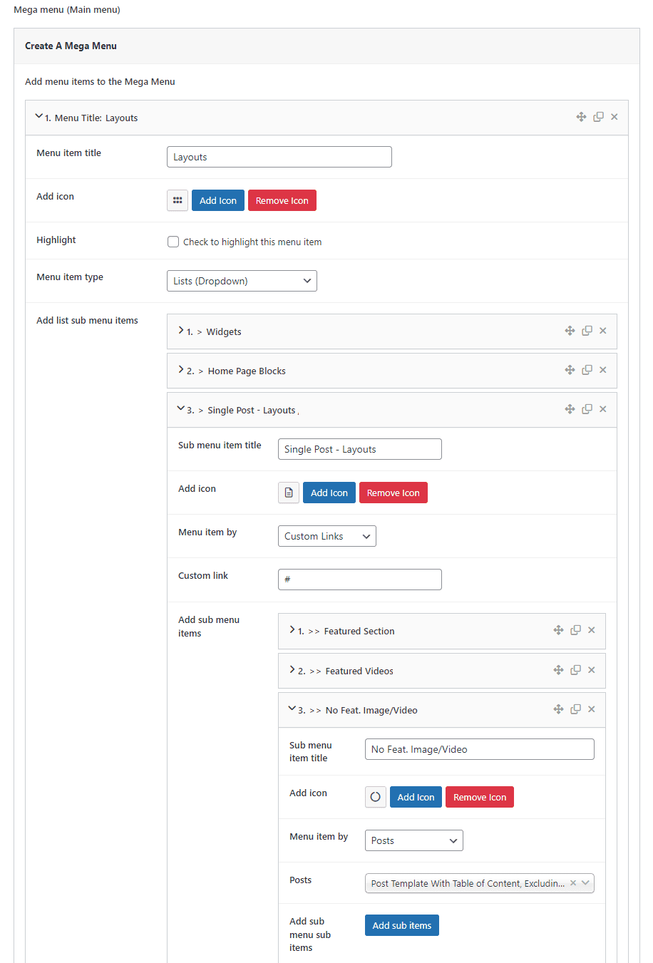
- Menu Item Title: Enter a title for your menu item.
- Add Icon (optional): Click the “Add Icon” button to include an icon for your menu item.
- Highlight (optional): Check this box to highlight the menu item.
- Menu Item Type: Select the type of menu item:
- “Normal (Without dropdown)”: For a standalone menu item without a dropdown.
- “List Dropdown”: To create a dropdown menu with a list of items.
- “Megamenu”: To create a complex dropdown menu with multiple columns.
- Menu Item Link: Choose the link destination for your menu item:
- Specific options like Post, Page, Category, Tag, or Custom Link can be selected here.
⟶ Creating List Dropdown Items:
If you selected “List Dropdown” in the previous step:
- Click on the “Add Sub Items” button to create sub-menu items.
- Follow the same process as above Add Menu Items: to add sub-menu items.
- Repeat these steps to add more sub-items as needed.
⟶ Creating Mega Menu:
If you selected “Mega Menu” in the previous step, follow these steps:
- Mega Menu Type: Choose the type of mega menu:
- Lists: Create a mega menu with list items in different columns.
- Thumbnail: Create a mega menu with posts and thumbnails.
If you selected “Lists“: follow this steps
- List Columns: Select the number of columns for your mega menu lists:
- 2 Columns: Display list items in two columns.
- 3 Columns: Display list items in three columns.
- 4 Columns: Display list items in four columns.
- 5 Columns: Display list items in five columns.
- Menu Lists: Click on the “Add Menu List” button to add list menu items:
- List Menu Title: Enter a title for your list menu item.
- Add Icon (optional): Include an icon for your list menu item.
- Add List Items: Click on the “Add List Item” button to add list items:
- List Item Title: Enter a title for your list item.
- Add Icon (optional): Include an icon for your list item.
- Menu Item By (Link): Choose the link destination for your list item:
- Select options like Post, Page, Category, Tag, or Custom Link etc.
Repeat these steps to add more list items as needed.

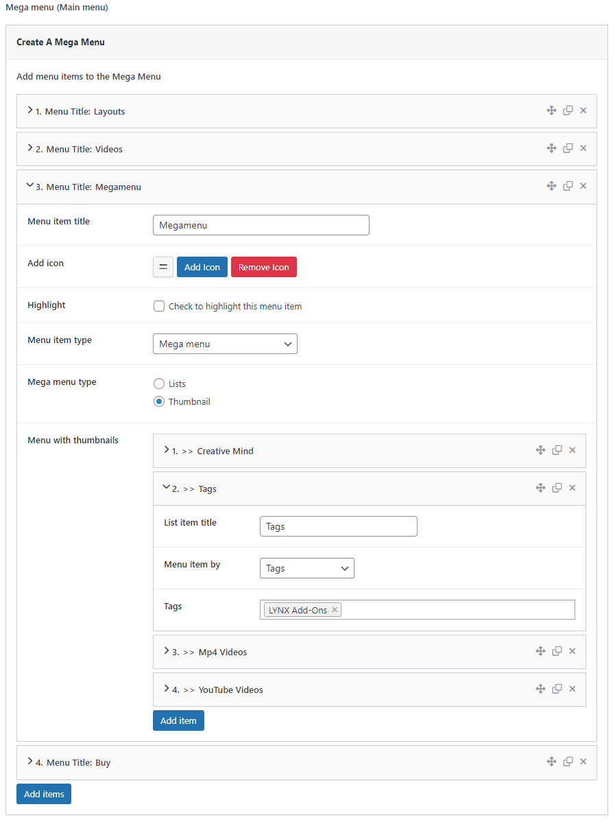
If you selected “Thumbnail“: Follow these steps:
- Menu with Thumbnails: Click on the “Add Item” button to add thumbnail mega menu items:
- List Item Title: Enter a title for your list item.
- Menu Item By: Choose thumbnail menu items by:
- Post: Display selected post titles & thumbnails.
- Pages: Display selected post titles & thumbnails.
- Videos: Display selected video titles & thumbnails (requires installation and activation of the “LYNX Add-ons” plugin and enabling Videos in the options).
- Channels: Display selected video channel titles & thumbnails (requires installation and activation of the “LYNX Add-ons” plugin and enabling Videos in the options).
- Categories: Display post titles with thumbnails by selected categories.
- Video Categories: Display video titles with thumbnails by selected video categories (requires installation and activation of the “LYNX Add-ons” plugin and enabling Videos in the options).
- Video Hash Tags: Display video titles with thumbnails by selected video hash tags (requires installation and activation of the “LYNX Add-ons” plugin and enabling Videos in the options).
- Select options like specific posts, pages, categories, tags, etc.
Repeat these steps to add more list items as needed.
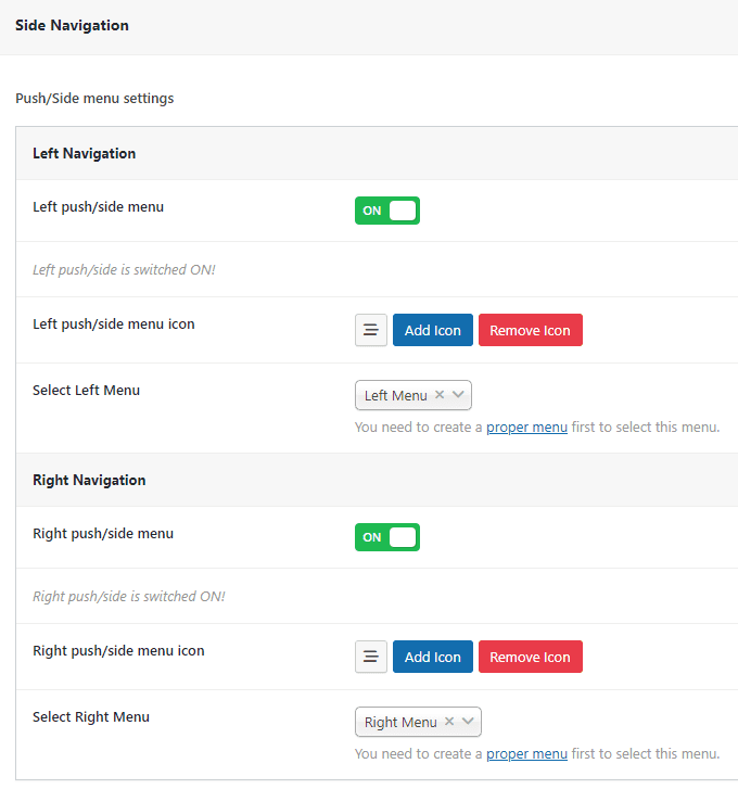
⟶ Creating Push/Side Menu/Navigation:
- Left Push/Side Menu Switcher: Enable or disable the left push/side menu. When enabled, you can configure the left push/side menu.
- Left Push/Side Menu Icon: Set an icon to trigger the left push menu.
- Select Left Menu: Choose a menu to display in the left push/side menu.
- Right Push/Side Menu Switcher: Enable or disable the right push/side menu. When enabled, you can configure the right push/side menu.
- Right Push/Side Menu Icon: Set an icon to trigger the right push menu.
- Select Right Menu: Choose a menu to display in the right push/side menu.
